Activating Global Asias
Feb 2022 Issue #6

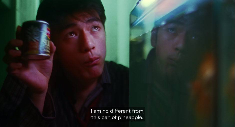
Chungking Express (still), 1994
✲
With you people it’s always ‘Out with the old, in with the new!’
You realise what goes into making a can of pineapple?
The fruit is grown, harvested, sliced — and you just throw it away!
How do you think the pineapple feels?
Buddy, I just work here.
Chungking Express (still), 1994
What’s in an expiry date? Like the protagonist of Wong Kar Wai’s Chungking Express, who buys a can of pineapple every day with the expiry date of 1 May to see if his love has expired, we might fight against the passing of time or let the days approach us with placid acceptance. Birthdays, anniversaries, days of remembrance for those who’ve passed, these dates stick in our minds like the stamp printed on the side of a can of pineapple.
Back in 2023, when Emma and Rosabel from the Satellites team invited me to work with them to create the visual identity and website for their new programme, questions about time and identity came to the forefront.
The initial brief described Satellites as ‘a temporal intervention focused on enhancing access to three strands of knowledge’, with the ‘long-term aim of supporting the development of a unique Asian Aotearoa voice’.
Trying to untangle this vision statement when deciding to take on the project left me feeling hesitant. What is a ‘unique Asian Aotearoa voice’? Do I have one? Can we do our best to try to make one? What would it look like? How long is ‘long-term’? The idea of making work about ‘being Asian’ brought back some earnest-but-cringe memories of clumsy visual metaphors, and hand-stitched booklets from early undergraduate art school courses (the evidence of which is probably still sitting in a dusty box in a Wellington garage somewhere); the risk of falling into clichés seemed high.
The idea of making work about ‘being Asian’ brought back some earnest-but-cringe memories
The possibility of pushing through this awkwardness and finding something new ended up being strong enough to get me to bite, even if it meant overcoming my own hesitations around deploying my identity in the workplace. Not to mention it seemed like a good moment to ‘reconnect’ with things happening back home: Asian-Aotearoa-art-adjacent I remain, even if my working hours land in a very different time zone.
To start a dialogue (or at least share my confusion), I opened the first brand-identity presentation by offering up these questions:
What does it mean to create something that ‘looks Asian’ when you’re working with visual identity? Self-stereotyping is one proven avenue. Think East Asian dragons, pagodas, Chinese calligraphic seals and zig-zagging red geometric borders. Think Sanrio kitties, bottles of sriracha hot sauce, mass-produced jade stones, and increasingly odd combinations of tropes such as Mahjong Rubik’s Cubes. While there’s still a genuine joy in these tropes, in their shiny and tactile readymade quality, you can’t help but feel like they’re products of an idea of a cultural heritage stuck in time, that could only be imagined by diasporic people who no longer live in the places where these things were originally invented. Like a Simpsons episode from a more recent season, the same characters and jokes start to get old. Not to mention that these tropes generally privilege East Asian culture over the massive cultural scope of South Asia, Southeast Asia, Central Asia and beyond.
How do you avoid ‘self-stereotyping’ while still being proud of your heritage?
From the beginning of the project, it was clear that the idea of creating a ‘universal’ visual language that encompasses the diverse range of cultural identities, practices and types of knowledge that Satellites represents was not possible or desirable.
One other way to sidestep the monolithic bloc of ‘identity’ would be to investigate the deeply specific and the personal. There are certainly beautiful stories to find here, and a tenderness to telling them that brings with it its own power. But as a visual language for a project that contains the stories of others, it wouldn’t feel right. And besides, can’t we make a statement with design, something that is confident, sexy and bold? Something that establishes itself without the typical shyness that fits the ‘Asian’ stereotype?
The idea of a monolithic Asian identity is something the Satellites project deliberately aims to challenge, instead splitting and stretching this label into a larger, more expansive view of what it means to be ‘Asian’ in Aotearoa. Our aim was to see this act as a generative process that helps us understand ourselves better and aims to open up room for new expressions of what this identity could be.
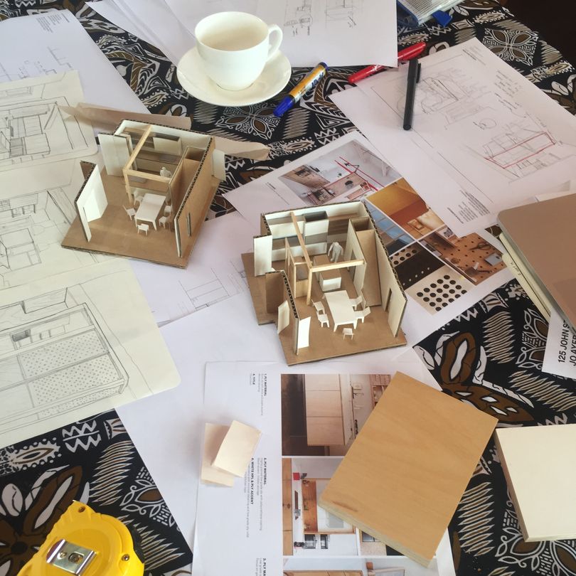
Satellites concept sketch, 2023
Following this, we aimed to develop the Satellites branding to work with rather than against this stretching of the boundaries of identity. The opposite of fixed and universal is flexible and specific. After all, if our identities are not fixed, why should we try to fix them into something universal?
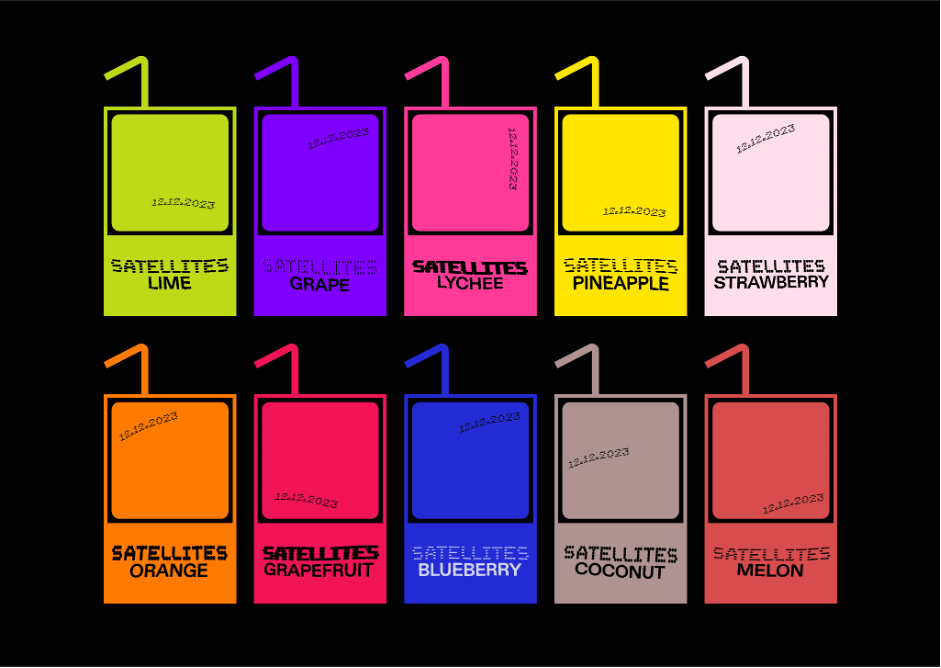
What we landed on was the distinctive warped ‘expiry date’ lettering. Expiry dates are a marker of a specific point in time, alluding to the storage and archiving of cultural memory. And like the expiry dates on the cans of pineapple juice and preserved lychees in the dairies and convenience stores that are cornerstones of Kiwi Asian immigrant life, the Satellites brand is a unique label that stretches and warps — but is never the same twice.
It is important that this distorted lettering on the website remain technically ‘live’ even as we apply distortion to it, meaning you can select, copy and paste the text normally. Live, programmatically determined text rendering allows us to utilise our unique typography in many areas of the website, instead of being limited to only inserting static image stand-ins for major headlines. Each time a visitor loads a page of the Satellites website, a unique combination of typographic variables is randomly selected to determine the appearance of the ‘expiry date’ text. To achieve this, we used a variable font that can change its properties in real time via code — font weight, stroke length and rotation of the stroke direction can be modified live as the user browses the site. Secondly, visual filters in the web browser apply subtle distortion effects, allowing for fully live generation of the typography while leaving the text intact, which has the added bonus of allowing screen readers and other accessibility tools to work normally.
The expiry-date motif used in the Satellites visual identity embraces the distortion and acts of translation/mistranslation that take place in migrant cultures, rather than seeing them as a faulty diversion from a canonical and monolithic idea of Asian identity. Being flexible can be seen here as a sign of strength and adaptability — of Asian identity responding to the context of Aotearoa and life as tangata Tiriti, and also between different Asian cultural identities finding commonalities in Aotearoa. People from migrant backgrounds have always had to adapt in various ways, and the visual identity of Satellites follows in these footsteps. In order to carry a whole host of stories from many different locations, the visual identity needs to be structural, systemic and conceptual.
The act of design here is more about choosing what axes and parameters the identity can exist and shift within. Rather than simply being a ‘dynamic’ logo on top of a conventional brand kit, the parameters of subtle distortion are embedded typographically within the whole Satellites project. The design framework refuses to conform to a single coherent shape, while still orbiting around the core principles of its variable components, much like the Satellites project itself morphing around the various identities and practices it supports and showcases.
If my memory of her has an expiration date, let it be 10,000 years …
The current three-pronged Satellites programme of events, magazine and online archive relates to the past and future in different ways. Public programming provides momentary gatherings of ideas and voices, the magazine allows for a slower process of exploring ideas and topics that unfold over the course of months, and the online archive aims to create a new collective cultural memory of the history of Asian artists in Aotearoa, which has the potential to last decades, if not longer. After all, if you can’t remember the past, how can you build on what has come before? And if you do remember, what new things can you make from the vantage point of the present?
The website search and filter features allow for many ‘entryways’ into a large and complex archive that will hopefully grow in detail and size over time. The more connections that are added over time, the more valuable these search and filter functions become, allowing for unique connections to be made across the history of Asian Aotearoa diaspora — whether it’s Chinese heritage dancers active in the 2010s or Stokes Valley sculptors in the 1960s. Editors and archivists can also explicitly create connections between items within the archive, adding another layer of interconnectedness for users to discover.
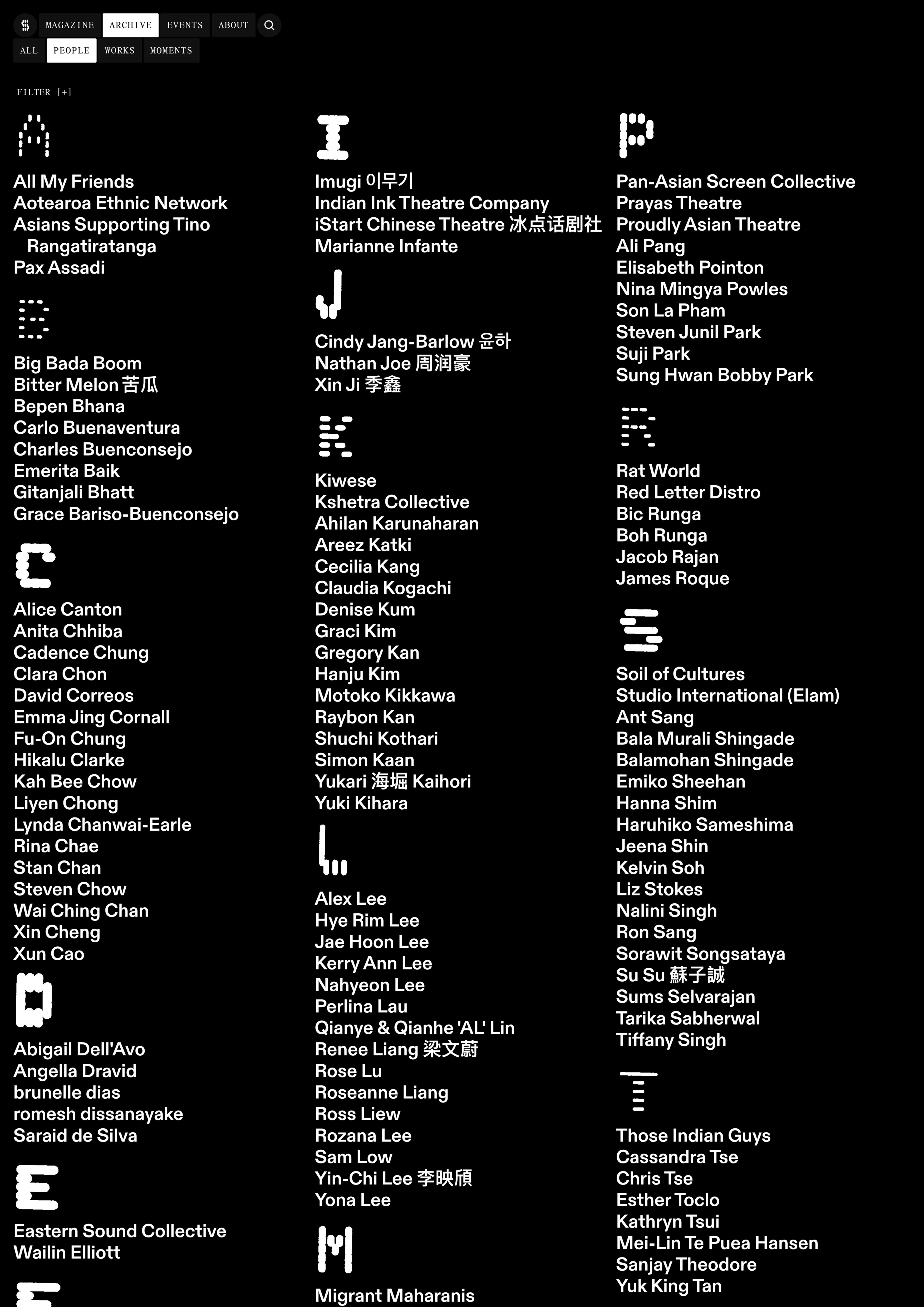
Index page in the Satellites archive, 2024
If we want to avoid perpetually starting from scratch, being doomed to repeat the same conversations over and over, the maintenance and longevity of an archive (even a partial one) is a good place to start. Finding a unique ‘Asian Aotearoa’ voice turns out to instead be finding many voices — my own included. If the Satellites archive can carry our voices into the future, we will be lucky. I hope to see other archives, publications, quarterly reviews, websites and magazines that piece together their own view of Asian Aotearoa identity from the fragments of past and present. It might take a designer’s fear, fully embracing the distortion of a coherent visual identity so that the voices of others can be heard.
For Satellites, the expiry date is a visual marker of a specific point in time that hints at the storage and archiving of cultural memory. We wonder, once that date is up, are the contents of the can no longer good to serve? Or will our identities just split and shift once again? Like our lovesick protagonist from Chungking Express, we ask: how does the pineapple feel?

Son La Pham
Photo by Andrei Blidarean